Academic-Looking Plots
This tutorial is meant to document the Plots.jl features I use to get an "academic"-looking plot like this:

I am new to Julia, so keep in mind that I don't yet have a strong grasp of the most idiomatic way to get plots to look the way I want. This tutorial was made with Literate.jl; you can find the source code here. Let's start with the required imports:
using Plots
using LaTeXStrings
We'll be using the GR backend:
gr()
Plots.GRBackend();
The plots are related to a simple time-delayed linear system. The parameters don't matter too much, I just wanted curves that looked a certain way.
τ = -1
τ′ = -2
T = abs(τ)
t_extra = 1
t_end = T + t_extra
x_minus = 0
f = 1000
λ = -0.7
A = 0.8;
Now that I've specified the parameters describing the curves, let's generate them:
t = range(τ, stop=t_end, length=Int((t_end - τ)*f))
Δt = t[2] - t[1]
u = A*sin.(0.8*π*(t.-τ)).*exp.(λ*(t.-τ))
x = x_minus .+ cumsum(u).*Δt

t′ = range(τ′, stop=t_end, length=Int((t_end-τ′)*f))
u′ = [u[1:f*T]; zeros(f*abs(τ′-τ)); u[T*f+1:end]]
x′ = x_minus .+ cumsum(u′).*Δt

t_y = range(0, stop=t_end, length=Int(t_end*f))
y = x[1:length(t_y)]
y′ = x′[1:length(t_y)];
Here's a deuteranopia (green color-blindness) friendly palette I found in an excellent tutorial. The red color is actually from another nice tutorial.
Σ_color = "#092C48"
Σ′_color = "#C59434"
accent_color = "#6F7498"  # Unused in this example
light_blue_color = "#A3B7F9"
red_color = "#FF4242";
Next comes the plot parameters. The Computer Modern font is needed to match the body text in academic conference and journal papers (in computer science and engineering, at least).
font_family = "Computer Modern"
guide_font_size = 12
title_font_size = 13;
The widen parameter tightens the plot's viewport around the x- and y- extents, which are generated based on the input signal \(u(t)\).
widen = false
annotation_font_size = guide_font_size
lw = 2.5
x_extent = [τ′, t_end]
y_extent = 1.15*[minimum(u), maximum(u)]
y_extent2 = y_extent .+ 0.2
y_extent3 = y_extent2;
The rectangle convenience function is from this tutorial. I use it to shade sections of the plots.
rectangle(w, h, x, y) = Shape(x .+ [0,w,w,0], y .+ [0,0,h,h])
shaded_alpha = 0.15;
Custom x-tick labels are easy to specify:
x_ticks = [-2, -1, 0, 1, 2]
x_tick_labels = [L"{\tau'={-2}}", L"\tau={-1}", 0, L"\tau_{+}=1", 2]
y_ticks1 = [-0.2, 0.2, 0.6]
y_ticks2 = [0, 0.4, 0.8]
y_ticks3 = y_ticks2;
Let's get plotting! I don't want any x-tick labels in this top plot. Most of the arguments here are fairly straightforward.
p1 = plot(t, u, linecolor=Σ_color, linewidth=lw, label=L"u(t)", legend=(0.88, 0.65), framestyle=:box, widen=widen, yticks=y_ticks1, xticks=(x_ticks, ["" for _ in x_ticks]))
plot!(t′, u′, linecolor=Σ′_color, linewidth=lw, label=L"u'(t)", linestyle=:dash);
I want red shading to highlight a key region of this first plot.
plot!(rectangle(T,12,0,-5), opacity=shaded_alpha, color=red_color, linewidth=0, label=false);I use LaTeXStrings.jl to conveniently place LaTeX annotations on the graph.
annotate!((0.52, 0.44, text(L"u(t)=u'(t)", annotation_font_size)))
annotate!((0.52, 0.22, text(L"\forall t \in [0, \tau_{+}]", annotation_font_size)));
All that remains is to set the title, font sizes, axis extents, and save the result as a PDF.
title!("Inputs")
plot!(fontfamily=font_family)
plot!(titlefontsize=title_font_size)
plot!(legendfontsize=guide_font_size)
plot!(tickfontsize=guide_font_size)
plot!(guidefontsize=guide_font_size)
xaxis!(x_extent)

yaxis!(y_extent);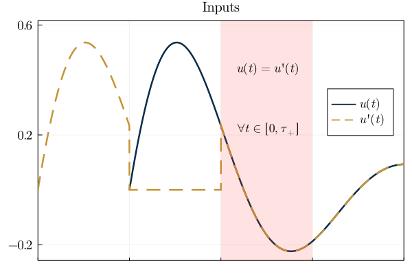
Note: each sub-plot has been configured to look good when put in the final multi-plot, leading to labels and legends in weird positions when displayed individually.
The second sub-plot is quite similar to the first:
p2 = plot(t, x, linecolor=Σ_color, linewidth=lw, label=L"x(t)", legend=(0.88, 0.65), framestyle=:box, widen=widen, xticks=(x_ticks, ["" for _ in x_ticks]))
plot!(t′, x′, linecolor=Σ′_color, label=L"x'(t)", linestyle=:dash, linewidth=lw)
plot!(rectangle(abs(τ),12,τ,-5), opacity=shaded_alpha, color=light_blue_color, linewidth=0, label=false)
plot!(rectangle(abs(τ),12,τ′,-5), opacity=shaded_alpha, color=light_blue_color, linewidth=0, label=false)
scatter!([τ], [0], markersize=4, markercolor=Σ_color, markerstrokecolor=Σ_color, label=false)
annotate!((-0.84, 0.17, text(L"x^{-1}", annotation_font_size)))
scatter!([0], [x[f]], markersize=4, color=Σ_color, markerstrokecolor=Σ_color, label=false)
annotate!((0.13, 0.57, text(L"x^0", annotation_font_size)))
title!("States")
plot!(fontfamily=font_family)
plot!(titlefontsize=title_font_size)
plot!(legendfontsize=guide_font_size)
plot!(tickfontsize=guide_font_size)
plot!(guidefontsize=guide_font_size)
yticks!(y_ticks2)
xaxis!(x_extent)
yaxis!(y_extent2);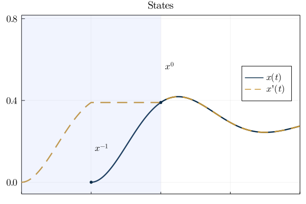
And the third plot is also very similar:
p3 = plot(t_y, y, linecolor=Σ_color, linewidth=lw, label=L"y(t)=x(t+\tau)", legend=(0.15, 0.65), framestyle=:box, widen=widen)
plot!(t_y, y′, linecolor=Σ′_color, label=L"y'(t)=x'(t+\tau')", linestyle=:dash, linewidth=lw)
plot!(rectangle(abs(τ),12,0,-5), opacity=shaded_alpha, color=light_blue_color, linewidth=0, label=false)
annotate!((0.37, 0.66, text(L"y(t)=y'(t)", annotation_font_size)))
annotate!((0.37, 0.44, text(L"\forall t \in [0, \tau_{+}]", annotation_font_size)))
xlabel!("Time (s)")
title!("Outputs");
However, it does have x-tick labels (since it's going to be at the bottom of our combined plot).
plot!(x_ticks=(x_ticks, x_tick_labels))
yticks!(y_ticks3)
plot!(fontfamily=font_family)
plot!(titlefontsize=title_font_size)
plot!(tickfontsize=guide_font_size)
plot!(guidefontsize=guide_font_size)
plot!(legendfontsize=guide_font_size)
xaxis!(x_extent)
yaxis!(y_extent3);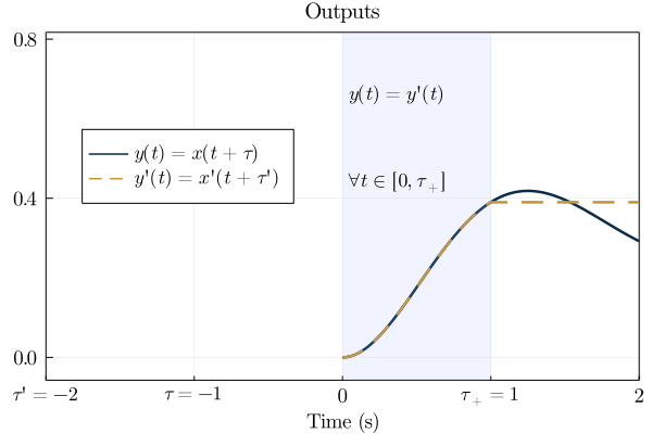
Plots.jl makes it really easy to combine the subplots into one figure:
p_final = plot(p1, p2, p3, layout=(3,1));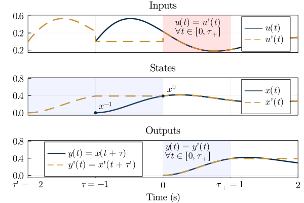
Finally, you can save your figure as a PDF (my preferred format for academic papers) with savefig("path/you/want.pdf").